A/B Testing Your Digital Content
As museum teams revisit their interpretive strategy in light of COVID-19, many are starting content development from scratch and asking their teams foundational questions like:
- What content do visitors want?
- What format do they want this content?
- What access points will they engage with?
We recommend starting with a single tour in your mobile guide, a single interactive screen, or other isolated project so that your team can keep your test focused and meaningful as you collect feedback and iterate based on your learnings.
What is A/B testing exactly?
A/B testing, also called split testing, is a research method for testing two versions of something to see which performs better with users. The most important thing to know about A/B testing is to keep it simple. That is, have clear goals for each test, test one variable at a time, and give the test ample time in front of your visitors so you can be sure that you’re collecting meaningful data.
Identify Your Goal & Define Your Test
This is likely the most complex part of your A/B testing. There’s often many competing priorities among a variety of stakeholders, so defining a testing goal will help focus and define your test. What you test will depend on the channel, the audience, and the content available to you. Many of our museum teams are testing video content against image and text to determine what leads to longer engagement while others are exploring conversion rates for when resources are linked to externally (an outside website) vs. adding an additional layer of content housed within the application. Key elements to test include content length, content type, and engagement time.
Below, a natural history museum shows how to test content on their in-gallery touchscreens. In this scenario, they are testing engagement time to better understand how much time visitors will invest in the touchscreen learning experience – will visitors click the learn more buttons or no? What is the overall engagement time and how do the number of pages viewed differ between the two experiences?
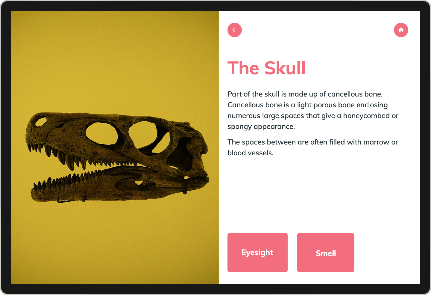
The Skull (Left)
This version adheres to digital content best practices – there is a single image and a brief text description. Most visitors will be able to explore this content in less than a minute which means they will have plenty of energy to continue through the rest of the application.
The Skull (Right)
This version has opportunities for deeper learning. In addition to the image and text, visitors can tap learn more buttons to take a deep dive into eyesight and smell. This page is a great way to test how far into the content a user will delve. What is the dwell time on The Skull, what is the click through rate on the learn more buttons, what is the dwell time on both Eyesight and Smell content pages, what is the overall engagement time and page views for each application as a whole?
If you determine that learn more buttons are worthwhile, then you can A/B test the number of buttons and the button titles. Isolating these tests allows you to truly understand which elements are influencing behavior (e.g. the button itself is or is not appealing vs. the copy used on the button).
Steps in Excavation (Left)
This version includes an image carousel with captions explaining that 10-step process of bringing this fossil into the museum. The user never has to leave the page but instead swipes through the image carousel to discover the full story. What is the dwell time and do you observe visitors actively swiping through all steps?
Steps in Excavation (Right)
This version displays three key steps in the process with shorter introduction text at-a-glance. Three learn more buttons also provide visitors the opportunity to dig deeper into the process according to the location. For example, those most drawn to the excavation can choose to explore “In the Field”. What is the dwell time and are they clicking through the learn more buttons?
You can also choose to do simpler tests, for example, a content page where all content is shared through a video vs a content page where the same story is shared through text. In all cases, the rest of the application should be identical to ensure that visitors are arriving on the test pages through the same channel, level of effort, and user experience.
If you’re A/B testing and including visitor interviews as part of your evaluation process, it can also be beneficial to test retention and learning outcome differences. Do you see measurable differences in what your visitors retain based on how they experience the content? People learn differently as well so do ask them to rate their preferred learning modes (Listening, Reading, Watching, Interacting).
Vanitas (Left)
The pair of images on the left show the museum using hotspots to highlight important details in the painting. The content pops up in a content card when the user taps a hotspots. Measure how many, if any, hotspots are tapped. What is dwell time?
Vanitas (Right)
The images on the right shows the same hotspot content (images and text) inserted into the body text. This creates a longer content page that requires significant scrolling instead of tapping, but the pages are easier to skim. Does the user read the entire page? How far do they skim? What is dwell time?
In this example, you are comparing how much content is being viewed and dwell time.
Getting the Test In Your Visitors Hands
It’s important when A/B testing content that you are testing A and B solutions simultaneously, among two randomly selected groups, and that you have a meaningful sample size. Testing at the same time across the same group size helps to cut down on other variables which could impact how people engage with your content and the choices they make.
For in-gallery testing, this could mean displaying two touchscreens in the gallery, one that displays test A and the other test B. For a mobile guide, you can choose to distribute one version of the tour via QR code to 50% of your visitors each day and a second nearly identical version of the tour via a second QR code to the other 50% of your visitors.
Sometimes tracking results via Google Analytics data over a long period of time is the best option – it’s anonymous and smooths out individual influence. Alternatively, you can do observational testing where you collect data from direct observation of users.
NOTE: For CultureConnect clients, we recommend duplicating your tour or content experience in the CMS and adjusting just the one page you’ll be using for A/B testing. Whichever page comes out on top can become the official experience and you can choose to hide the alternative version or even update it for a new round of A/B testing focused on another element in your content experience.
The Plan for Collecting Feedback
We’ve previously discussed approaches for collecting visitor feedback in the 3 Strategies for Successful Digital Projects but it’s always worth restating that offering multiple feedback opportunities is key as well as including different methodologies from visitor observation, surveys, and visitor interviews.


