Accessibility 101: Color Contrast
WHY DOES COLOR CONTRAST MATTER?
Color contrast between two elements whether that’s between text and background color, navigational elements like a button and background color, and any other meaningful content against a background is important to consider when evaluating user experience. Without proper contrast, information can be difficult for people to recognize and comprehend. This is true for all people – not just for the visually impaired. As we discovered with the blue-and-black/gold-and-white dress debacle, colors can be perceived differently for a variety of factors outside of one’s own eyesight.
SO, ARE THERE STANDARDS OR BEST PRACTICES?
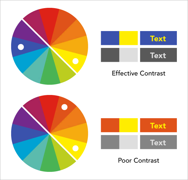
There are many tools to help you evaluate and test color combinations to see if they meet appropriate standards (we share a bunch below). Check out the color wheel to help develop your intuition around color contrast. Essentially, pick colors that are in opposite quadrants of the color wheel.
COLOR CONTRAST STANDARDS: THE SPECIFICS
The Web Content Accessibility Guidelines (WCAG) developed by the Worldwide Web Consortium (W3C) provides guidelines for two levels of compliance: AA and AAA.
The AA level requires a contrast ratio of at least 4.5:1 for body text and 3:1 for large text like headers and titles. That means color a must be 4.5 times darker (or lighter) than color b for body text.
To meet AAA guidelines, contrast must be 7.1 for body text and 4.5:1 or headers and titles. In terms of font size, body text should always be at least 14 point in print and 18.66px in digital. Headers should be 18 point in print and 24px in digital.
FREE TOOLS PLEASE!
Turning your website or design choices into gray-scale is a simple way to visually test. Fortunately, there are many free color contrast tools available on the web.
Use this Chrome plug-in to mimic colorblindness:
Here are a few of our favorites to double check your color selections choices:


