Kimbell Art Museum
By Teens, For Teens
The Kimbell Art Museum wanted to attract, educate, and engage teenagers by creating a mobile experience targeted specifically to teens. This meant not only creating interpretive content that was the right balance of fun and information, but also that the app itself was aligned with how teenagers use their smartphones and apps in their everyday lives.
The app reinvented the traditional mobile guide, empowering teens to interact and react using a variety of features such as photography, social sharing, games and respond in the language of emojis.
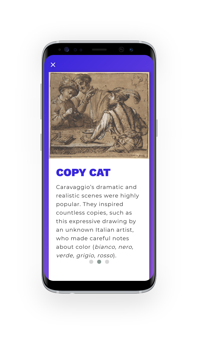
The Kimbell Teen Art Scope app is a free resource for visiting teens that is a little bit cheeky, nonlinear, and encourages self-guided discovery. The app includes two experiences: a self-guided “Spotlights” tour and scavenger-hunt full of “Challenges.”
Special Features
- Emoji Module Development
Products
- Advanced Mobile Guide
- Scavenger Hunt
Services
- Audience Research
- Concepting & Design
- Custom Software Development
Recognition
- Gold Medal, Mobile Applications, 2017, SEMC
- “Got Emoji?”, 2017, AAM
- “Teens and Technology in Your Museum”, 2016, MuseumNEXT NYC
Speaking Language of Emojis
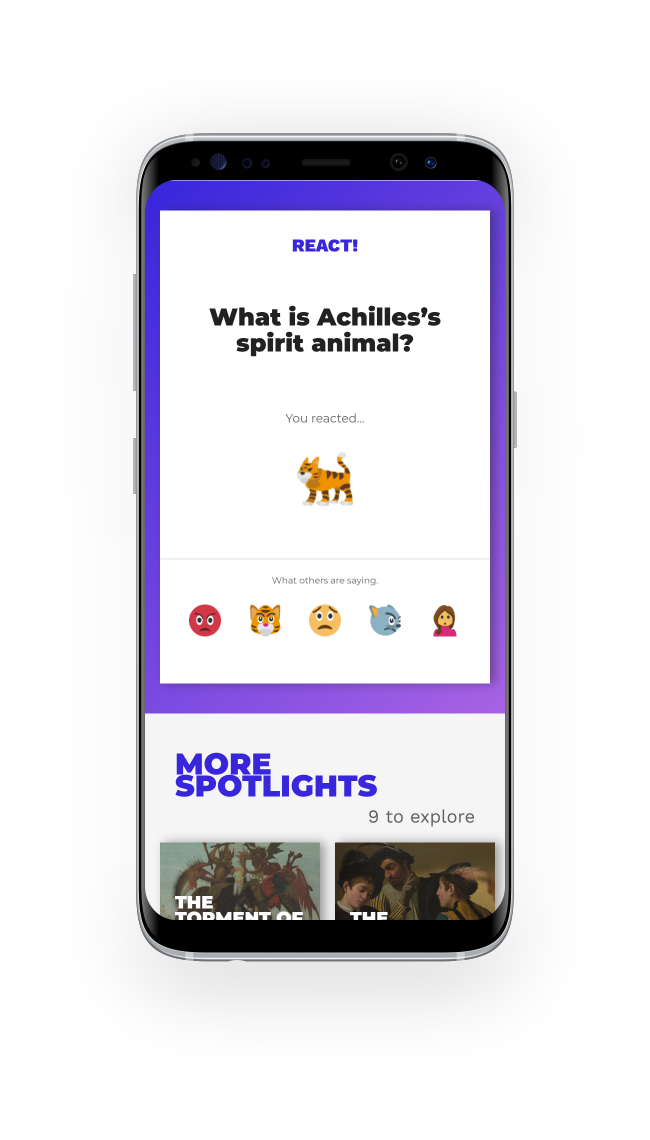
Whether through social media or messaging apps, teens increasingly communicate through a visual language. We applied the familiar – emojis – to the museum context. Museum educators asked (sometimes irreverent) questions that added a measure of playfulness while also encouraging reflection.
Add up to three creative responses from a full emoji keyboard and then see the top five trending responses.
Hotspots = Learning Touchpoints
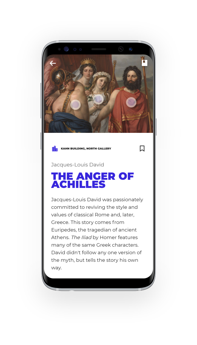
Both the Kimbell’s Teen Council and museum curators were consulted in the selection of artworks included in the app. Each artwork in the Spotlights Tour has 3–5 animated touchpoints that visitors may tap to learn more about the artwork in a multimedia pop-up. From explanations of painting details to surfacing related media or themes – hotspots create bite-sized interpretive nuggets that add up to a full meal.
A Grown Up Scavenger Hunt
The app’s Challenges section features a series of interactive activities through four clue types: multiple choice, free response, check-in, and photo challenges. Each challenges provides an interactive learning opportunity that can be saved on the visitor’s phone, shared on social media, or reset to play again. The Kimbell’s team used artwork memes and photo mashups to set the tone.
Get in the Mood...Board
During the design phase, mood boards were created to engage in discussion over both the look and feel of the app as well as desired behaviors. This helped build consensus among museum stakeholders who sought to create an edgy, distinctly teen-focused experience while not breaking from the Kimbell’s core brand.
Learn more about Mood Boarding in the Practicum resources section.
Research & Design Process Unpacked
CultureConnect began the project with an audience research study to understand teen attitudes, desires, and norms ultimately informing the app’s features, design and content. For example, learning about how teens use social media and messaging apps led to the development of an emoji response module.
New feature design like the Emoji Module, started concept wireframes and evolved into high fidelity mock-ups that were used for interactive prototype testing. The resulting emoji module experience was narrowed down from six iteratively tested versions.
Two Evaluation Methods
First, the Kimbell invested in a long soft-launch period once the application was completed. They targeted specific events where teens would be in large numbers and performed in-depth evaluation. For example, the Community Engagement Coordinator conducted in-person observations, interviews and surveys with dozens of teens to understand what was most lacking and appealing. Teens asked for more interpretive content (ah, the power of bite-sized chunks of layered content!), like being able to zoom into high-resolutions images, and enjoyed prompts for taking action instead of passively absorbing information.
Second, because the application is powered by a Content Management System, the Kimbell can access user analytics and manage the app at any time. User-submitted data (e.g. emoji responses) and behavior analytics (e.g. most popular stops) are available on a dashboard or via .csv download from the CMS so the museum can measure the application’s performance.
Explore the Kimbell Teen Art Scope on your own on the App Store and Google Play.


