Practicum Vol. 2: Mood Boards
WHAT IS A MOOD BOARD?
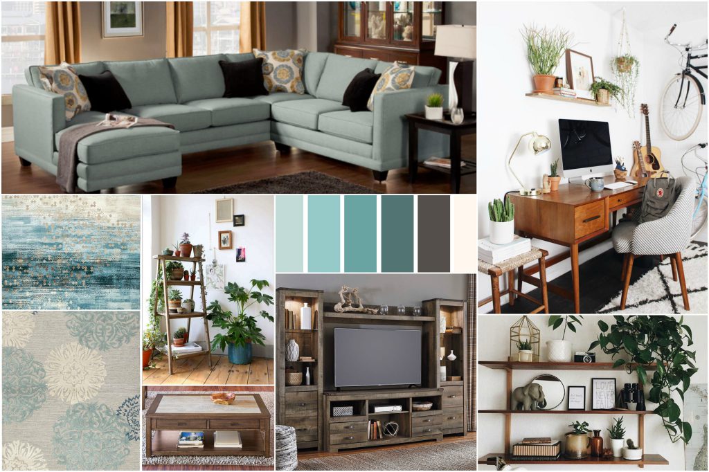
You may be familiar with mood boards from interior design shows – swatches of fabrics, color palettes, and furniture shapes and styles that give you a visual feeling of the designer’s vision for that room. Mood boards can include any image, material or text that helps evoke or convey a concept.
MOOD BOARDING FOR MUSEUMS?
Museums + Technology = doing something new or different in the museum. A museum with a well developed digital program may want to experiment with new technologies. A more “traditional” museum may want to incorporate digital for the first time. Regardless, there are often a lot of ideas (and feelings) at a table of stakeholders. Mood boards can be a safe, fun, and collaborative way to:
- Communicate: Convey, discuss, and refine concepts and ideas.
- Build Consensus: Move from emotion and abstraction to tangible, common ground.
EXAMPLE, PLEASE!
We worked with the Kimbell Art Museum in Fort Worth, TX to develop a mobile guide experience specifically targeted to teens. This project included audience research and new feature development, but before we got started on designing the application, we used digital mood boards to understand what the Kimbell was thinking, feeling and envisioning for this project.
Reverent irreverence was the overall goal. Something fun and edgy, while not off-putting or confusing given the museum’s existing brand and culture. Colorful and modern designs that might stretch the brand, while remaining rooted in the Kimbell’s traditions.
We created several mood boards around different aspects of the experience from ideas to behaviors to visual design. We heard the Kimbell mention ‘interactivity’ early on, so together we explored what that meant. How would teens interact with each other, with technology, or with the art?
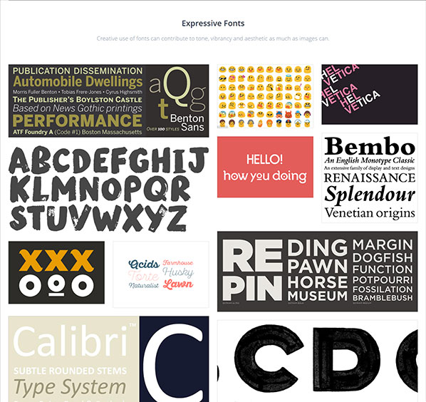
Making the experience ‘their own’ was another key concept we explored through images of identity and self expression. Fonts and typography are crucial elements in digital design. We played with their existing, traditional fonts and created bold alternatives. Through mood boarding we learned that the Kimbell team gravitated to large, block or heavy fonts rather than the highly scripted or stylized.
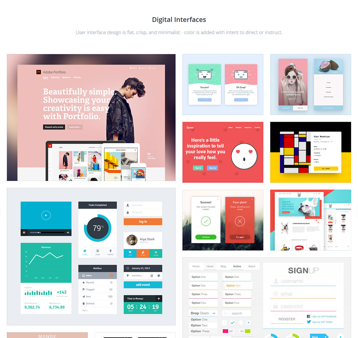
We also discussed the practical user experience to begin articulating the priorities for the user interface. Reinforcing clean, modern design and bold contrasting color, the Kimbell wanted image driven, intuitive, minimalist UI.
We learned through mood boarding that the Kimbell preferred bold, bright color pallets that incorporated blues, purples, oranges and reds. The images not only include those colors, but also hint at their inspiration – modern geometric buildings, blue jeans and converse sneakers, and murals and emojis. One of the great features of the mood board is the commenting feature, which we and the Kimbell team used extensively to prepare for or provide feedback after group discussions. The tool we use also extracts colors from the image automatically.
GOT ANY RECOMMENDATIONS FOR DIGITAL MOOD BOARDS?
Invision – We recommend Invision. It’s easy to add both images and digital links to the mood board. The commenting and sharing features are extensive, yet intuitive enough for collaborators to learn quickly. Invision also has a number of other digital project tools, many of which are free to use.
Some other options include:
GoMoodBoard – GoMoodBoard has similar but slightly more basic functionality to Invision’s mood boards. It’s also a site that does this one thing, while Invision has a large suite of design and workflow management tools.
Canva – Just like we’re the tool that lets you make museum apps without needing coding skills, Canva is the tool that lets you design without needing graphic design skills. In other words, it’s easy to use and happens to include some templates specifically for creating mood boards.
Adobe Spark – If you already use the Adobe Suite, this could be a great tool to add to your Adobe design arsenal. There is also a free version available.
LET’S GET PRACTICUM
We’ve launched Practicum – a series of kits, tools, how-to’s and generally good resources for digital strategy and design. All developed using industry best practices adopted for the museum world. Check it out here.
Need some help getting started or want someone to facilitate a mood boarding, empathy mapping or a user persona’ing exercise? Drop us a line here.


