Masonry, Your Interpretation Building Blocks
Design matters. We’ve launched Design Stories to showcase the versatility of our signature design tools. It’s like flipping through Architectural Digest for design inspiration… but for your touchscreen interactives.
First up, take a look at the Masonry system of layouts. Masonry’s distinctive feature is its flexible building blocks that can be configured and customized to solve your unique interpretation challenge. Tap on a tile to explore in-depth.
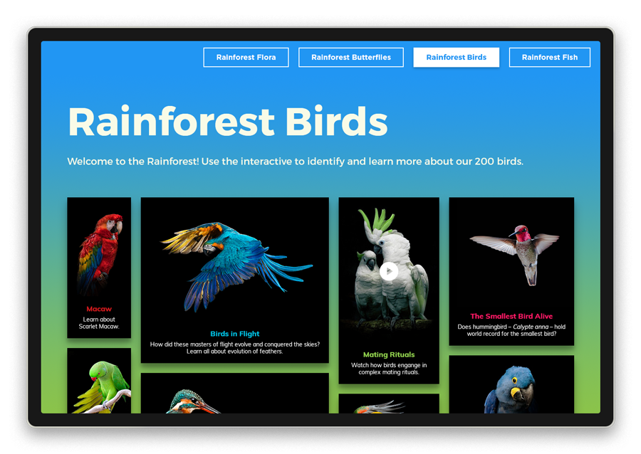
Masonry tiles are perfect for when you have many collection items to showcase, but want visitors to quickly, easily and visually navigate. This four-column varied width layout presents each bird with a custom colored title and brief caption popping on a black background. These are only a few of the design configurations at your fingertips to create a unique digital experience.
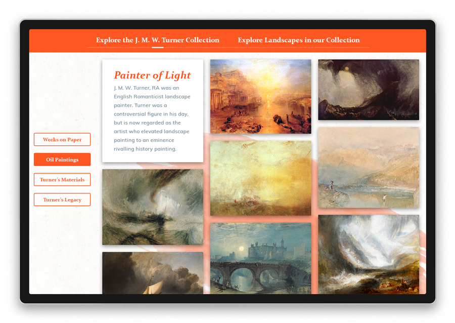
Our art museum clients frequently create a digital exhibitions highlighting the work of an artist. From a centralized starting point, you can discover not only the artworks but the process and materials used to create them. The left side and top navigation bars allow you to create and bundle multiple experiences.
While Masonry can go wide, it can also go deep. Amelia Earhart’s first flight is a single story deep dive showcasing media and long captions overlaying a custom background image. Scroll through key events and read the essentials or tap the tile to unlock more if interested.
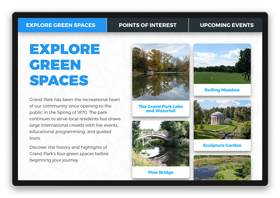
The orientation kiosk in a visitor’s center of parks, nature centers and campuses are critical for visit planning. Scan points of interest to survey what’s possible, then tap to learn the details and directions to start your journey.
All of our products have tons of design options and interactive features so you can make each digital experience on-brand and unique for your visitors. We hope you enjoyed this first Design Story and welcome your feedback!


