Practicum Vol. 6: The Wireframe Starter Kit
How-to Guide & Interactive Kit for Digital Interactives
Use the PowerPoint version to create wireframes with drag & drop elements
GET YOUR WIREFRAME STARTER KIT (PPT)
Use the PDF version to import into design software or to print out
GET YOUR WIREFRAME STARTER KIT (PDF)
SOOO….WHAT ARE WIREFRAMES?
Wireframes are a tool used by designers to understand the basic structure and function of an app. Wireframes are often constructed using simple black and white shapes.
WHY DO WE USE WIREFRAMES?
Wireframing is a great way to figure out high-level page layouts and user flows, like a storyboard. As a way to help you wireframe quickly and simply, without getting too hung up on the visuals, we’ve created some assets for you to pull from for your next wireframe exercise.
EXAMPLE WIREFRAMES & FINAL PAGES
When designing a digital interactive (or website of any kind) it’s tempting to consider look & feel, layouts, and storytelling all at the same time. But this can be distracting and overwhelming. Putting aesthetic and granular detail aside, wireframes help stakeholders focus on high-level layouts and information flow (a.k.a. Information Architecture).
Below are some examples of CultureConnect Advanced Interactive applications to illustrate what a wireframe looks like and how it can ultimately translate into a final page in an application.
COLUMN SCROLL – PANELS
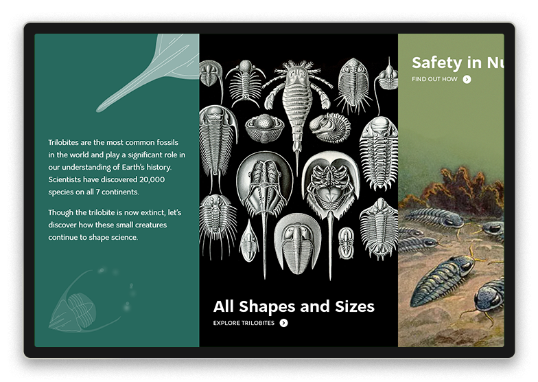
This example showcases the Column System of Layouts. The wireframe on the left points out that there is an intro panel with text as well as columns that scroll right to see more. Each column has an image with text above and below. The wireframe does NOT discuss content – the actual images used or fonts or words.
COLUMN SCROLL – WITHOUT SCROLL!
This is another example using the Column System of Layouts, however; this time we’re using an intro column and a single clickable column. The wireframe on the left points out the top navigation, intro panel text and call to action and the column that will feature the dress. The wireframe does NOT discuss content (which objects, what text) or the look & feel.
MASONRY LAYOUT & CONTENT DETAIL PAGE
The top pair features the Masonry Layout System which features an up-down scrolling. The wireframe shows the background image of Flaubert and that text will be included (but does not specify any aesthetic details!). It also shows the overall layout of the entry points – a pinterest-style up-down scroll.
The bottom pair features a content detail page – what you see when you tap on one of the entry points. The wireframe captures the essential elements: image container on the left, text on the right, learn-more buttons, and x-out navigation. Which letter, what button style etc. are design decisions that come in the next phase of the process.
BOTTOM CONSOLE
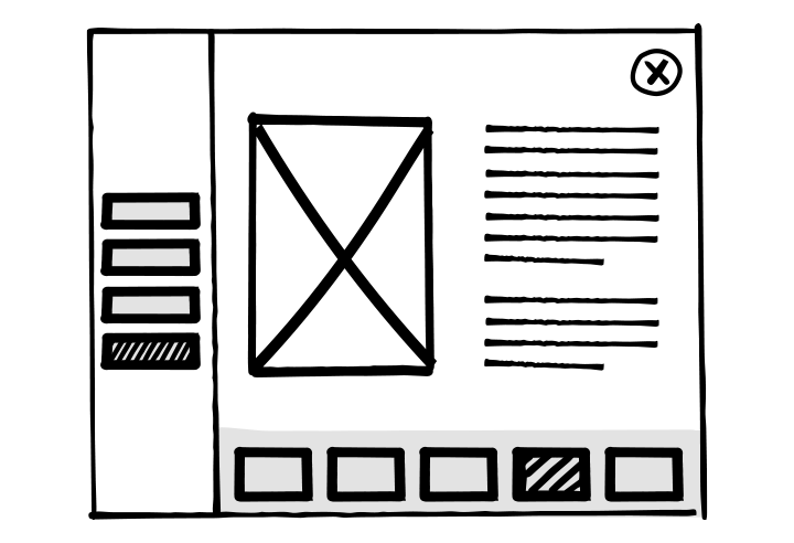
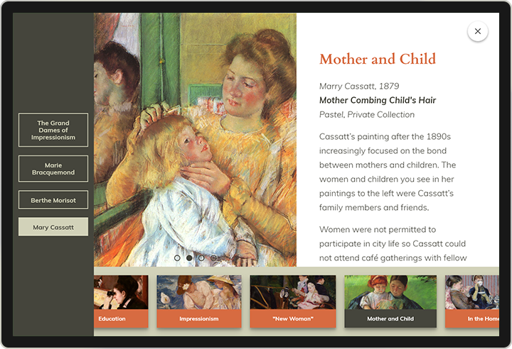
This wireframe features the Bottom Console Layout where the entry points are persistent and across the bottom. The wireframe features not only the bottom scroll items, but also a left side navigation. Tap on the left side buttons and view a different selection of bottom scroll items. Tap on a bottom scroll item and reveal a content detail page. Because the navigation is so busy, content is simple – image and text — as expressed in the wireframe.
3 EASY STEPS FOR CREATING WIREFRAMES
Step 1
Determine which pages you plan to include in your application. Commonly used application pages are attract screens, gallery pages, and content detail pages. The example above shows a content detail page with gallery selection along the bottom.
Pro tip: Create a site map or a diagram listing all your application’s pages.
Step 2
Next, think about the elements on each page: Titles, subtitles, body text, media, buttons, navigation etc. Now arrange these elements on the page.
In the Wireframe Starter Kit, page 2 includes several wireframe examples aligned to some CultureConnect interactives to help you create apps for our platform, or use these as inspiration for your own apps.
While this Wireframe Starter Kit includes examples of Advanced Interactives – stay tuned for more wireframing kits featuring mobile applications, digital labels and more in the months to come!
Step 3
Assemble your wireframe with the elements on page 3 of the Wireframe Starter Kit. You can do this a few ways:
- Drag and drop elements in the Powerpoint version.
- Open the PDF version in your preferred design program (such as Adobe Illustrator).
- Print out and cut out the shapes for an analog process.
Pro tip: Try several different wireframes for the same page. Moving the elements around may inspire you to tell the story in a new and exciting way.
GET YOUR WIREFRAME STARTER KIT (PPT)
GET YOUR WIREFRAME STARTER KIT (PDF)
SHARE YOUR WIREFRAMES WITH US!
Contact us here at hello@cultureconnectme.com or on Twitter


