Bring Archives and Library Collections to Life!
Archives are treasure troves for storytellers, history buffs, and the insatiably curious among us. When speaking with libraries, institutional repositories, and special collections, we are often asked to transform a collection of letters, documents, or folios into a dynamic digital interactive. Here are four recent examples to inspire you!
LETTERS
Personal letters, business communications, and private journal entries are ideal primary resources for better understanding historical events, an author’s relationships, and their personality.
Letter collections typically present these interpretation obstacles:
- Large volume of documents
- Lack of legibility due to handwriting and document aging
- Inability to read due to foreign language
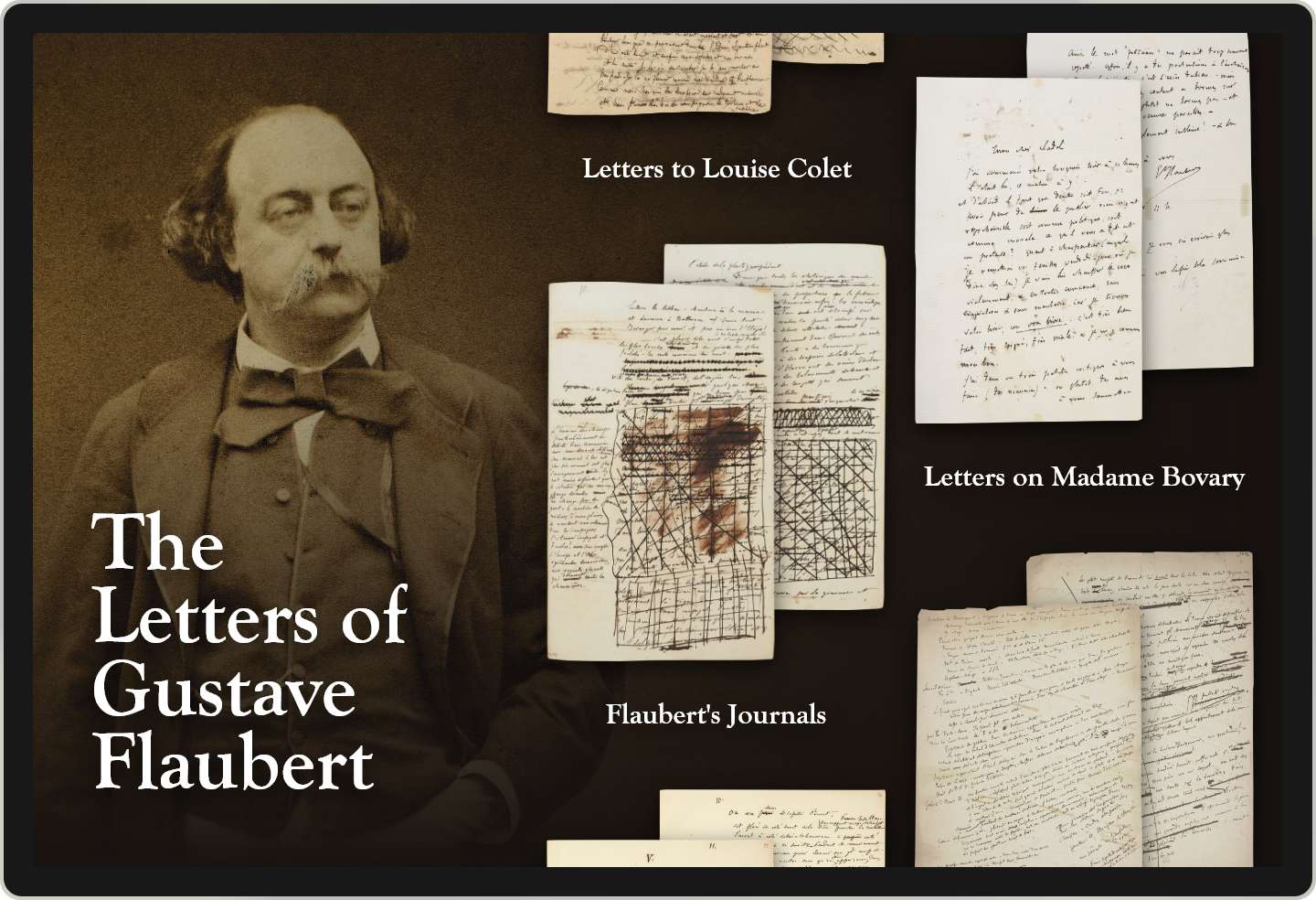
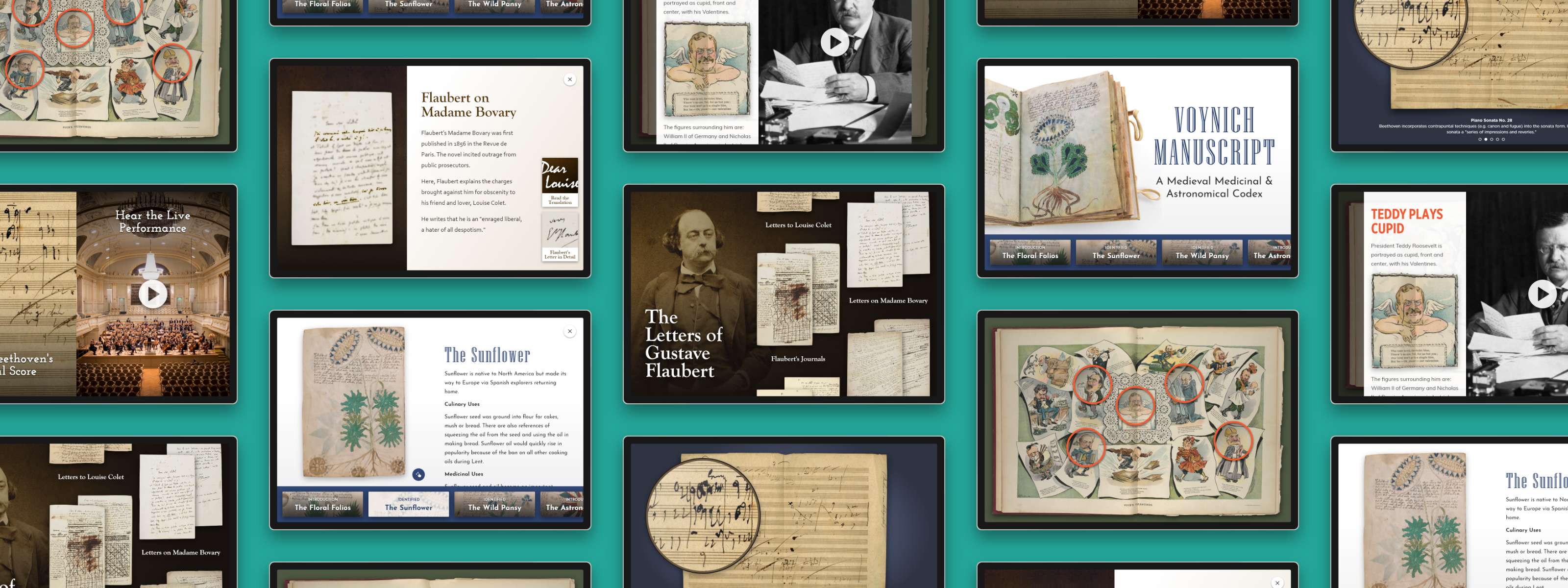
In this example, we’ve tackled these three pain points by deploying our Masonry template. The Masonry template makes it easy to divide and present a large volume of content, thematically. Visitors are able to have a self-guided learning experience, diving into the themes that appeal to them most. Scrolling up-and-down, then tapping a selection brings the user to a document detail page.
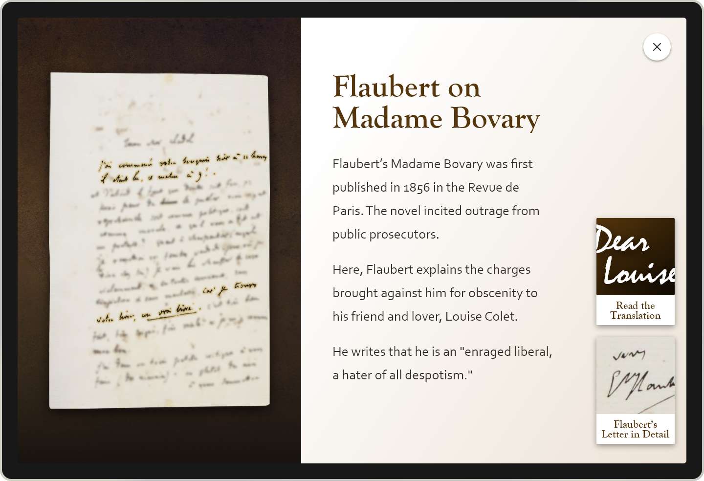
In this example, you can read Gustave Flaubert’s letters connected to his masterpiece, Madame Bovary. The letter was personal correspondence with a friend. The highlighted passages point to his frustration with the public reception of the novel and the resulting obscenity trial. To dive deeper, tap the buttons: Either read the translation or Flaubert’s letter in detail which lets users zoom and examine the document.
PERIODICALS
Periodicals are filled with first-hand accounts of historical events but also reveal a lot about the day-to-day lives of people living when the newspaper or magazine was published. Advertisements, comics, and satirical cartoons go deeper to reveal popular opinion, political unrest or descent, and act as a window into current events.
Periodicals often present these obstacles:
- Lack of visibility into all pages since it is a bound or multi-page document
- Lack of historical or political context for contemporary interpretation
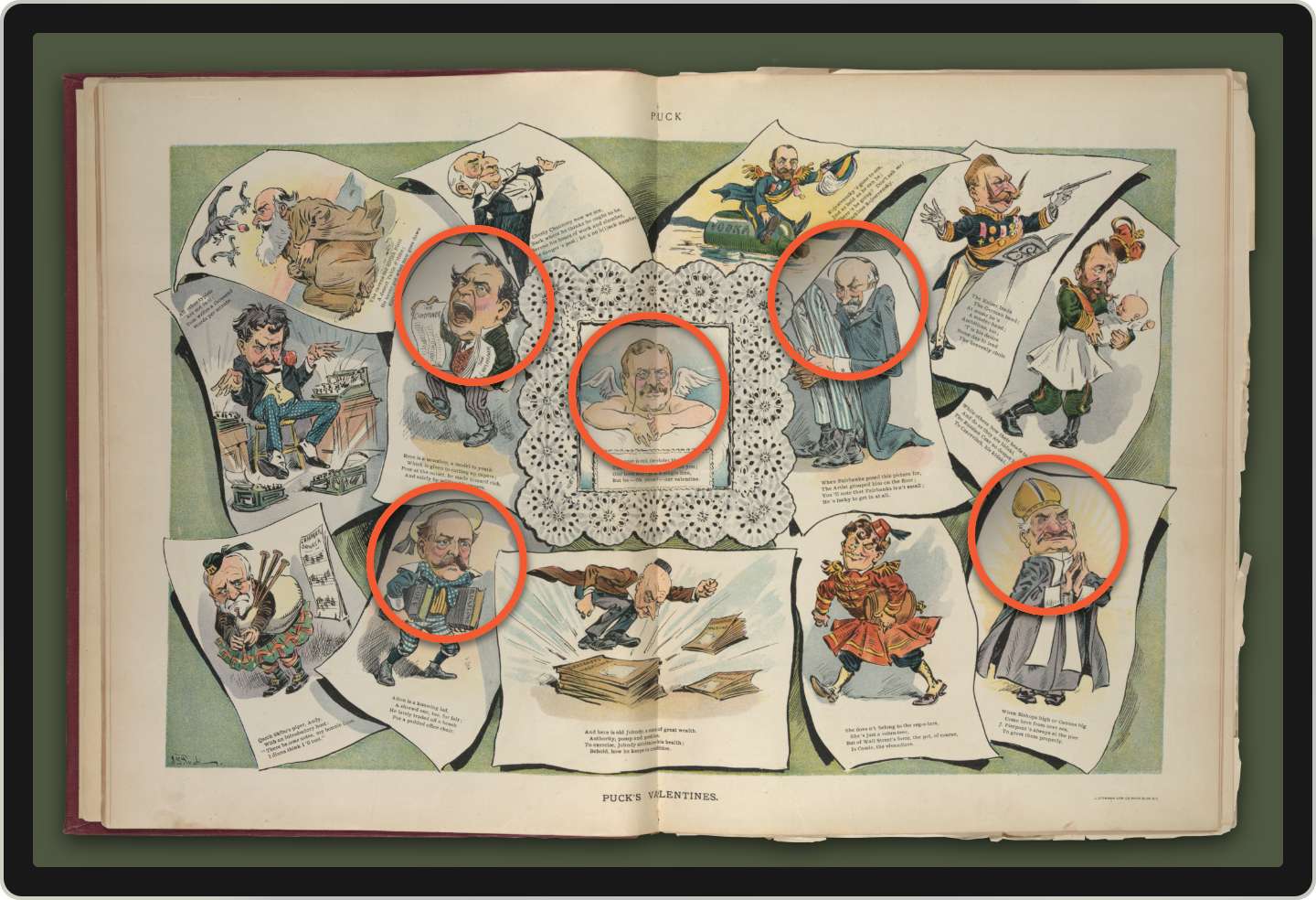
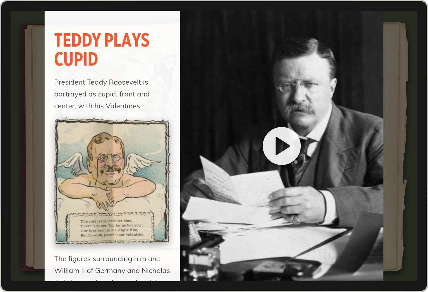
In this example, the visitor can examine a satirical cartoon from Puck, America’s first successful humor magazine. Using the Artifact tool, users can tap an animated hotspot over key elements to better understand the illustrator’s intention. Discover who these figures were, how they were related to Teddy Roosevelt, and why the illustrator made this the central graphic for Puck’s 1905 Valentine’s Day publication.
SCIENTIFIC JOURNALS & CODEX
Scientific illustrations in journals and ancient codex have the potential to challenge us with every document-based collection obstacle which is one reason that our team enjoys these interpretation challenges.
Some of these include:
- Lack of context for understanding illustrations, often requiring specialized scientific knowledge (or outdated scientific knowledge)
- Large volume of pages that cannot be viewed simultaneously
- Lack of legibility due to handwriting and document aging
- Inability to read due to foreign or period language
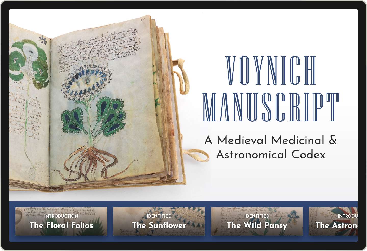
This codex has volume and depth which is why we’ve used the Bottom Console tool. Visitors can understand the illustrations and scientific notations as well as the common medieval uses and contemporary context. This ever-present navigation allows visitors to explore in depth without ever losing track of where they are.
While a scientific journal or codex may seem inaccessible to the average visitor, you bridge this divide by unpacking the pages with interpretive text, multi-media, language translation, image analysis, and more. Advanced Interactives support sophisticated concepts and learning with an intuitive user experience.
MUSICAL SCORES
Musical scores lend themselves to dynamic, media-rich interpretation. Visitors are able to examine the original score in detail, including the composer’s notes, revisions, and marginalia and then, listen to a musical performance.
A few obstacles that musical scores can present:
- Lack of legibility due to handwriting and document aging
- Lack of understanding for those visitors that do not read music or have extensive knowledge of music history
In this example featuring Beethoven’s Piano Sonata No. 28, we’ve used the Column System of Layouts to lead visitors down two paths: the first is an in-depth exploration of the original musical score and the significance of the composer’s innovations. Here, the visitor can better understand the creative process, the markings on the document, as well as the historical context. This creates learning experiences for novices and experts, alike. The second path leads to audio and video of live performances of Beethoven’s work. For the novice, this helps brings the document to life and for the expert, it’s another chance to enjoy the music they already love.
Have a document driven collection and need help concepting a digital interactive? Let us know!
